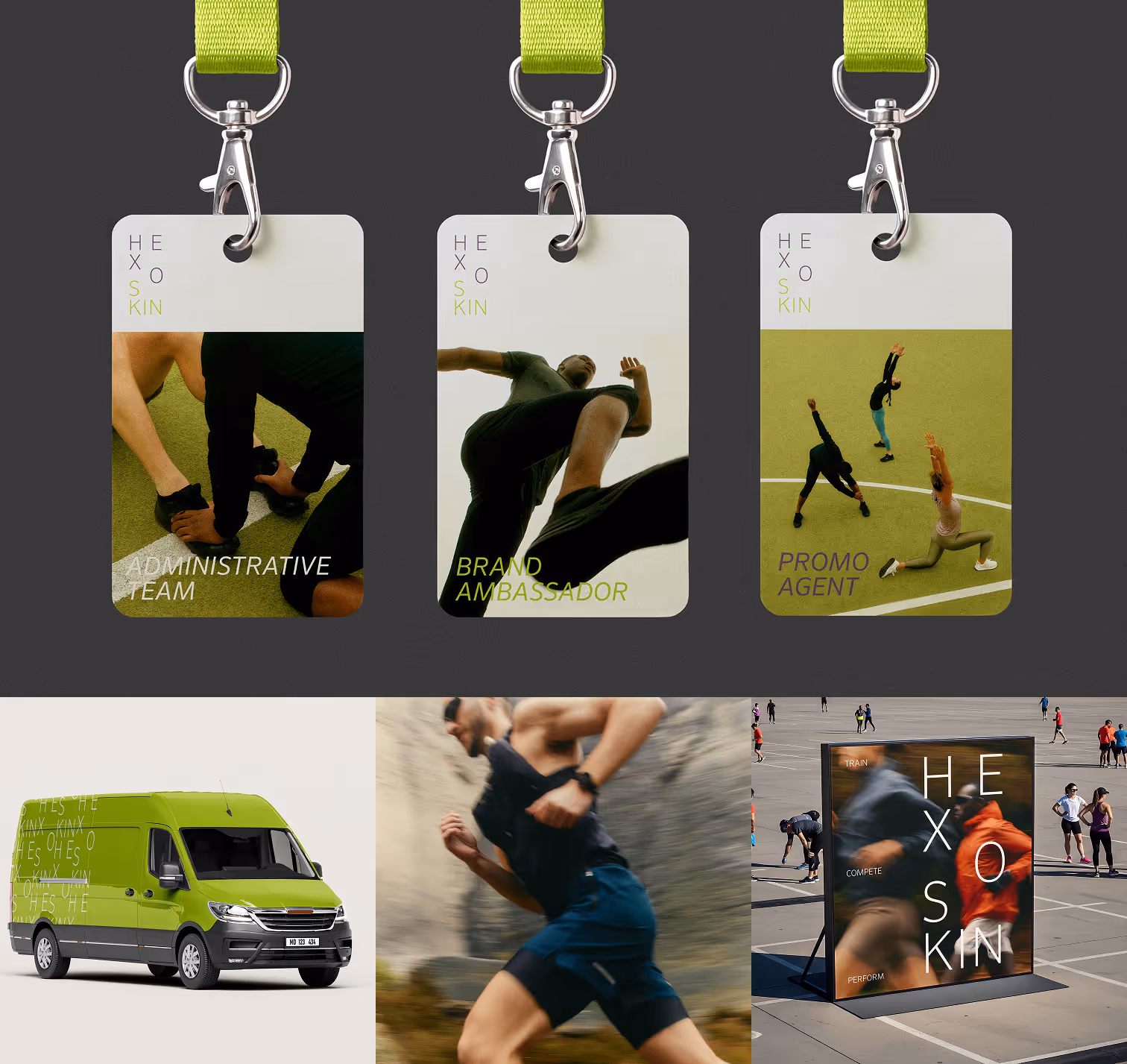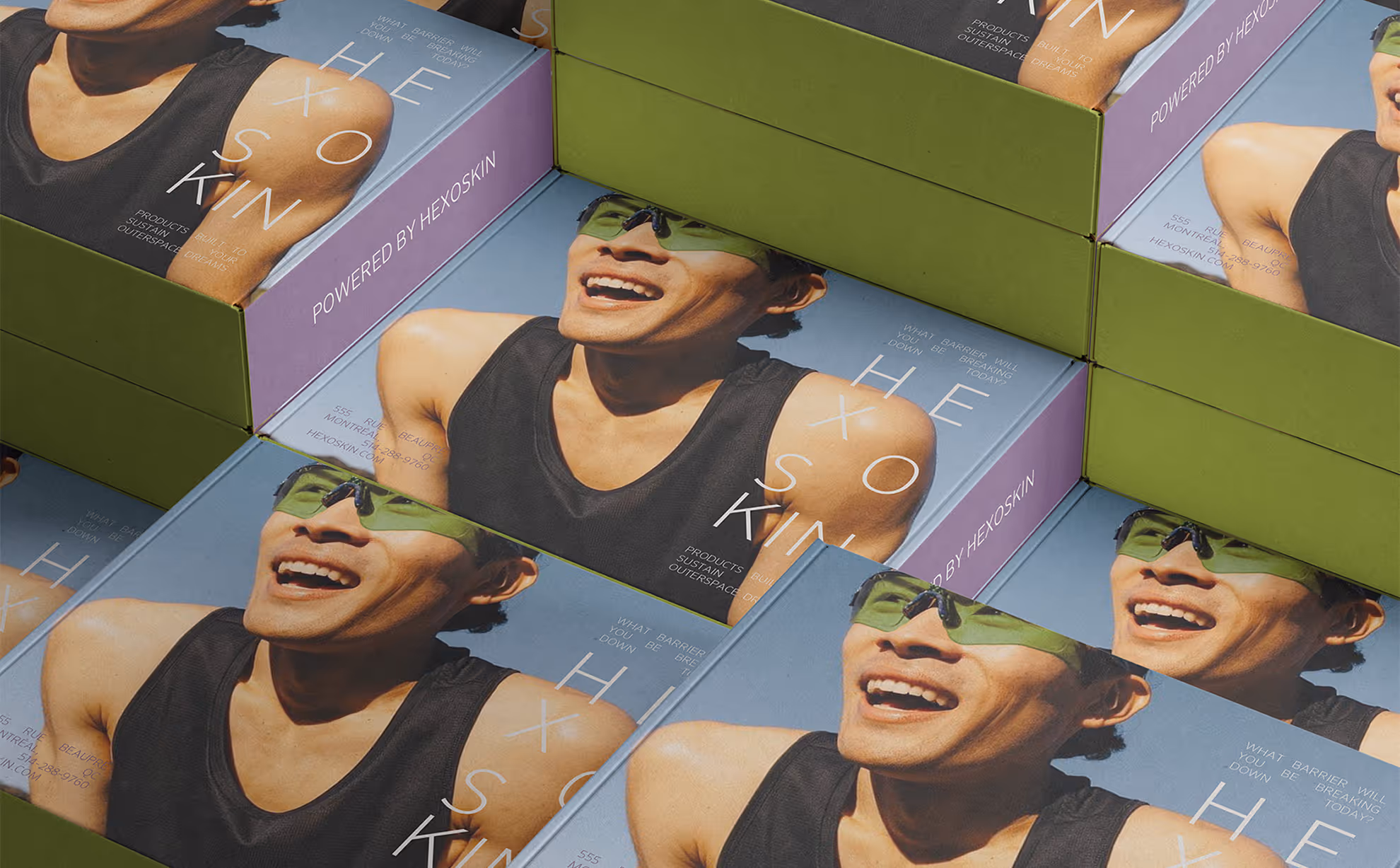
This project proposes a full rebrand built on the same principles that define the product itself to create a cohesive system. Precision. Structure. Intention. Every decision from typographic to chromatic was made in service of one goal: making Hexoskin express its power.
Hexoskin is a Montreal-based health tech company creating clinically validated smart garments that track vital signs through textile-embedded sensors. Used in over 275 scientific studies and deployed in space through the Canadian Space Agency’s Bio-Monitor, its technology delivers precise, portable, and non-invasive health monitoring worldwide.
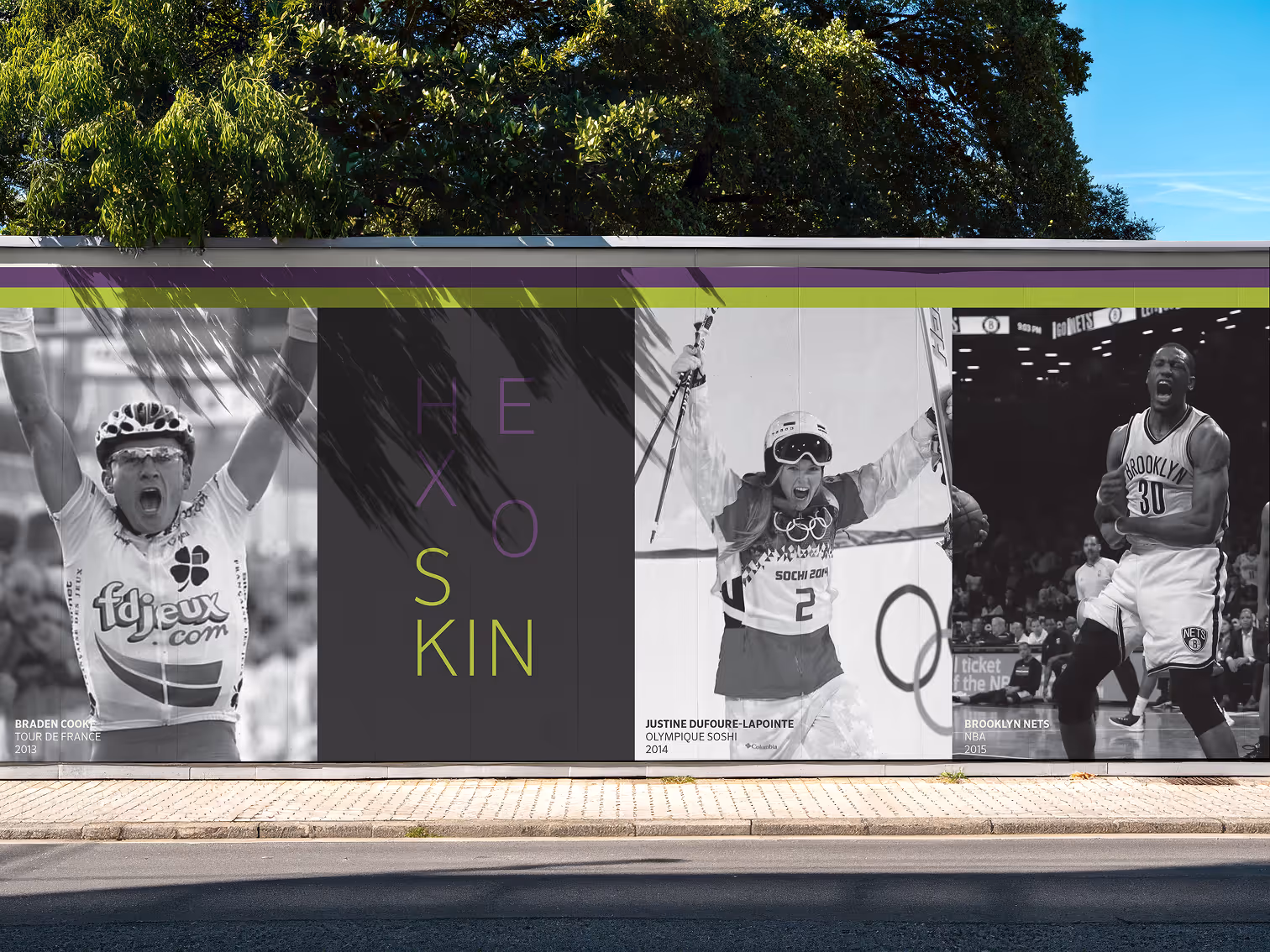
Hexoskin targets high-level athletes, researchers, and medical professionals who depend on precise, clinically validated data to optimize performance and care.
By redefining Hexoskin’s brand identity, the goal was to create a cohesive system across all product lines and align better with its professional audience. While the technology is cutting-edge and scientifically credible, the visual identity needed to reflect that same precision, rigour, and innovation.


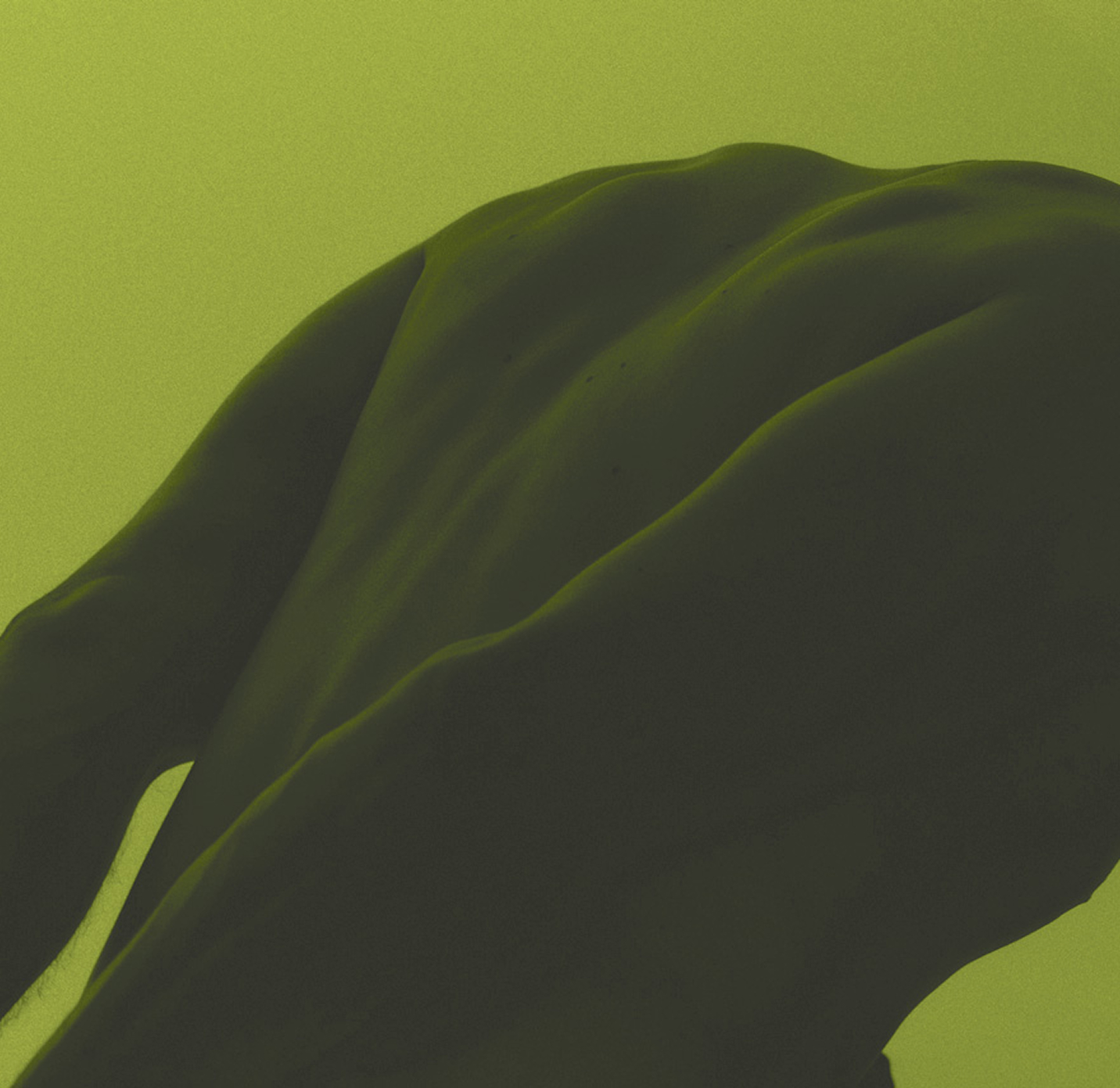

The concept began with the idea of the sensor being encased within a garment. I was drawn to the relationship between the body and technology, something highly technical yet seamlessly integrated and protected. The rectangular form emerged as a metaphor for enveloping and containment, reflecting how the garment houses the sensors. I was also inspired by biometric imagery, especially heat maps and signal scans. Their gradients and flowing data patterns informed the color direction and the adjoining pattern integrated into the branding. I wanted the identity to feel grounded in the science itself, translating the invisible data of the body into something structured and tangible.
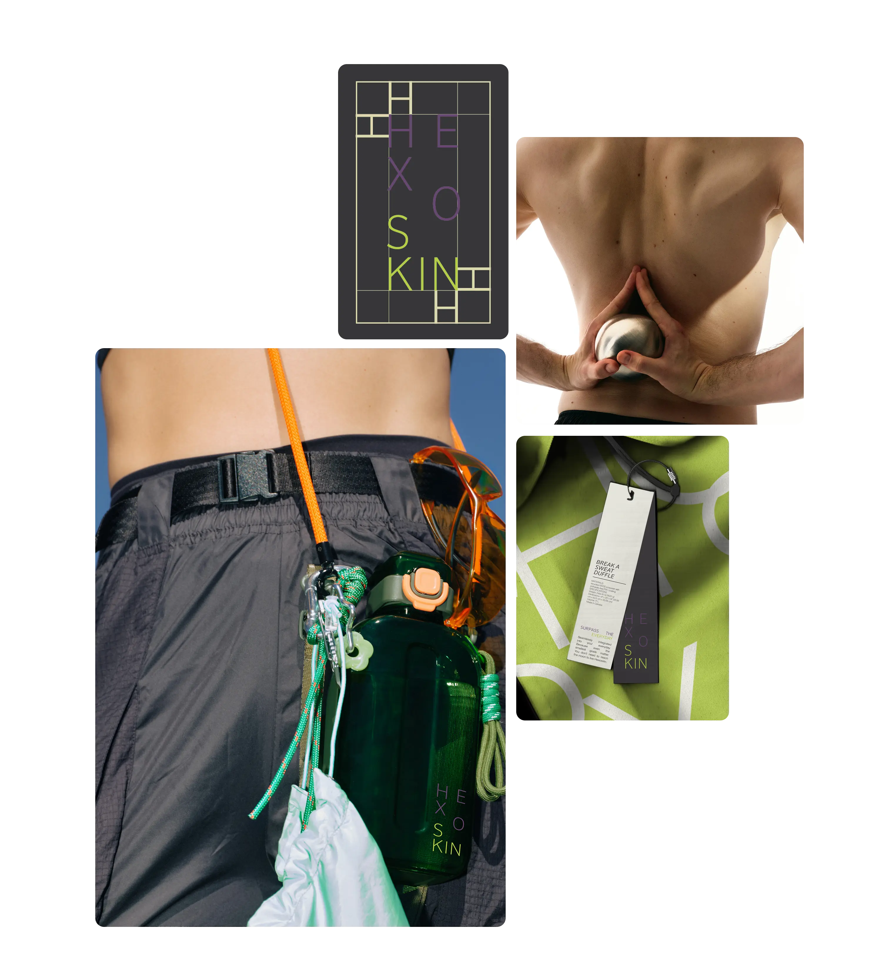
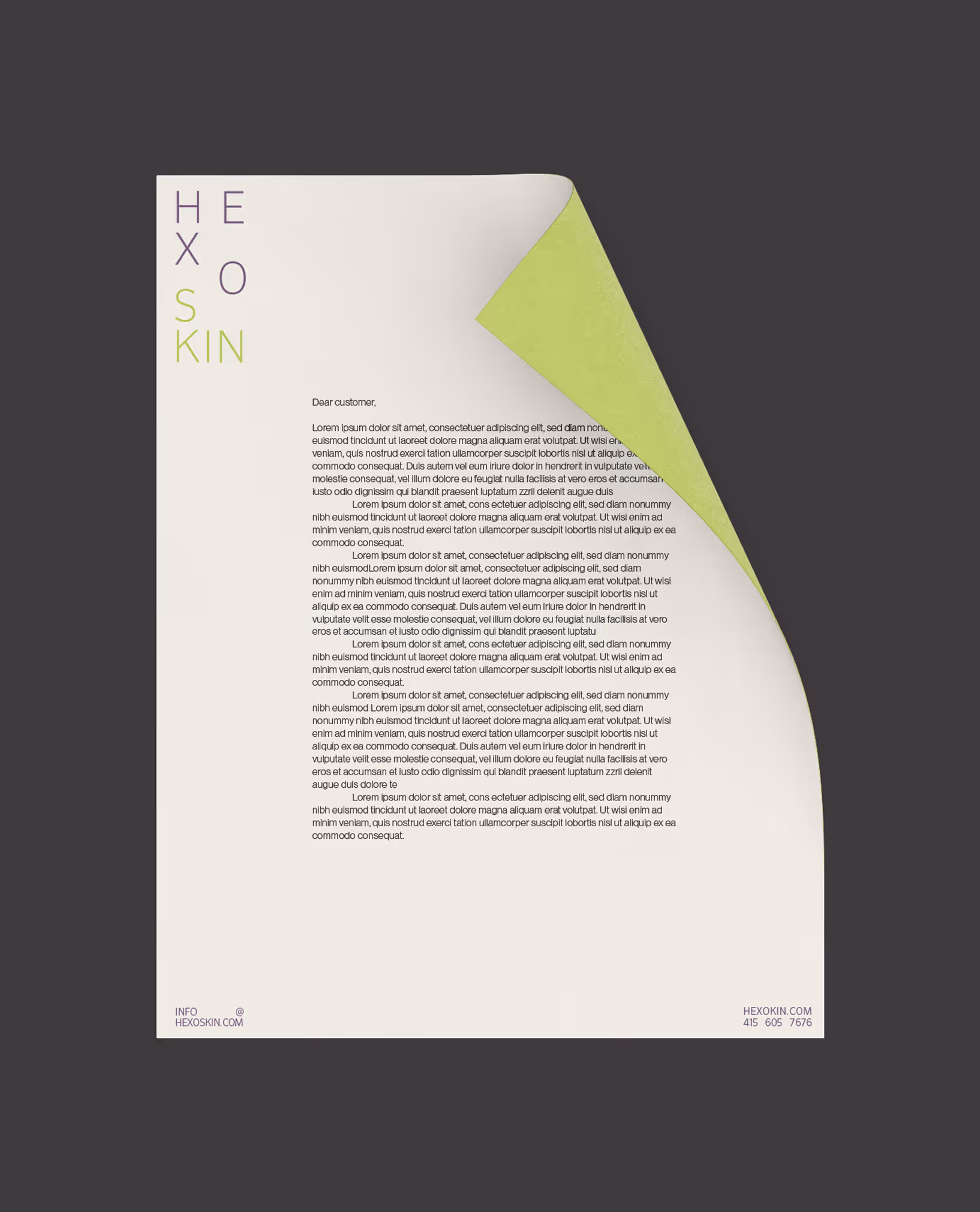
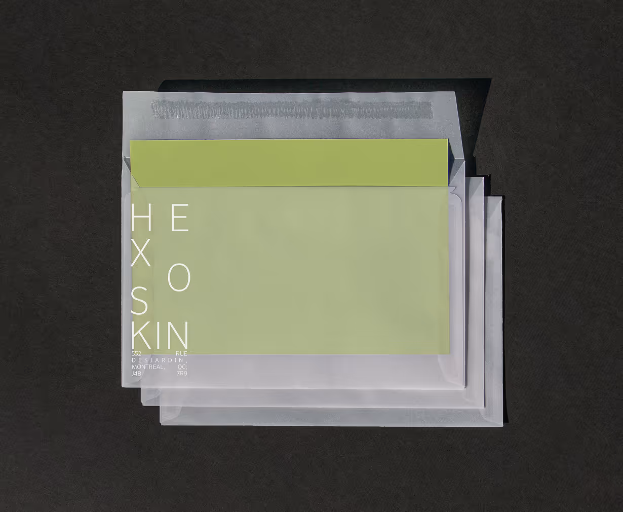
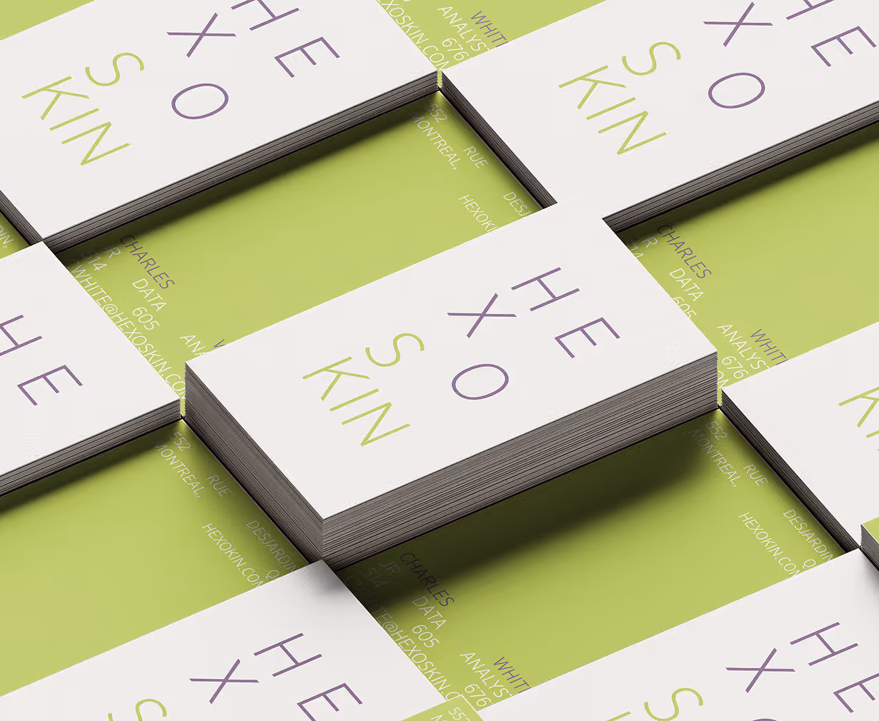
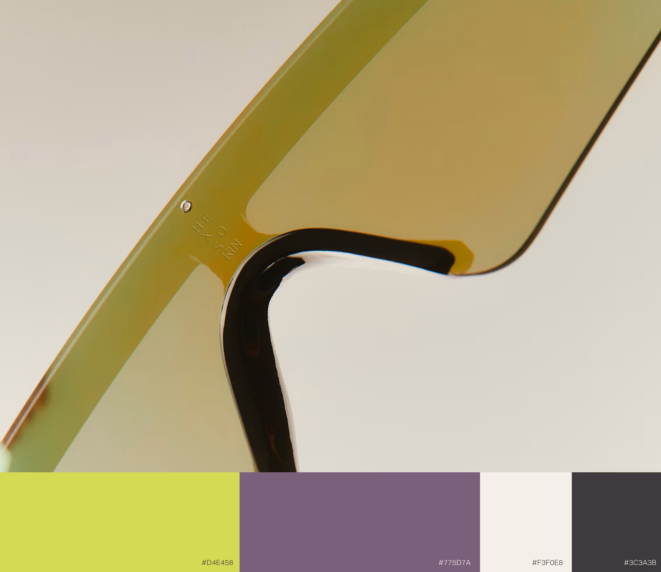
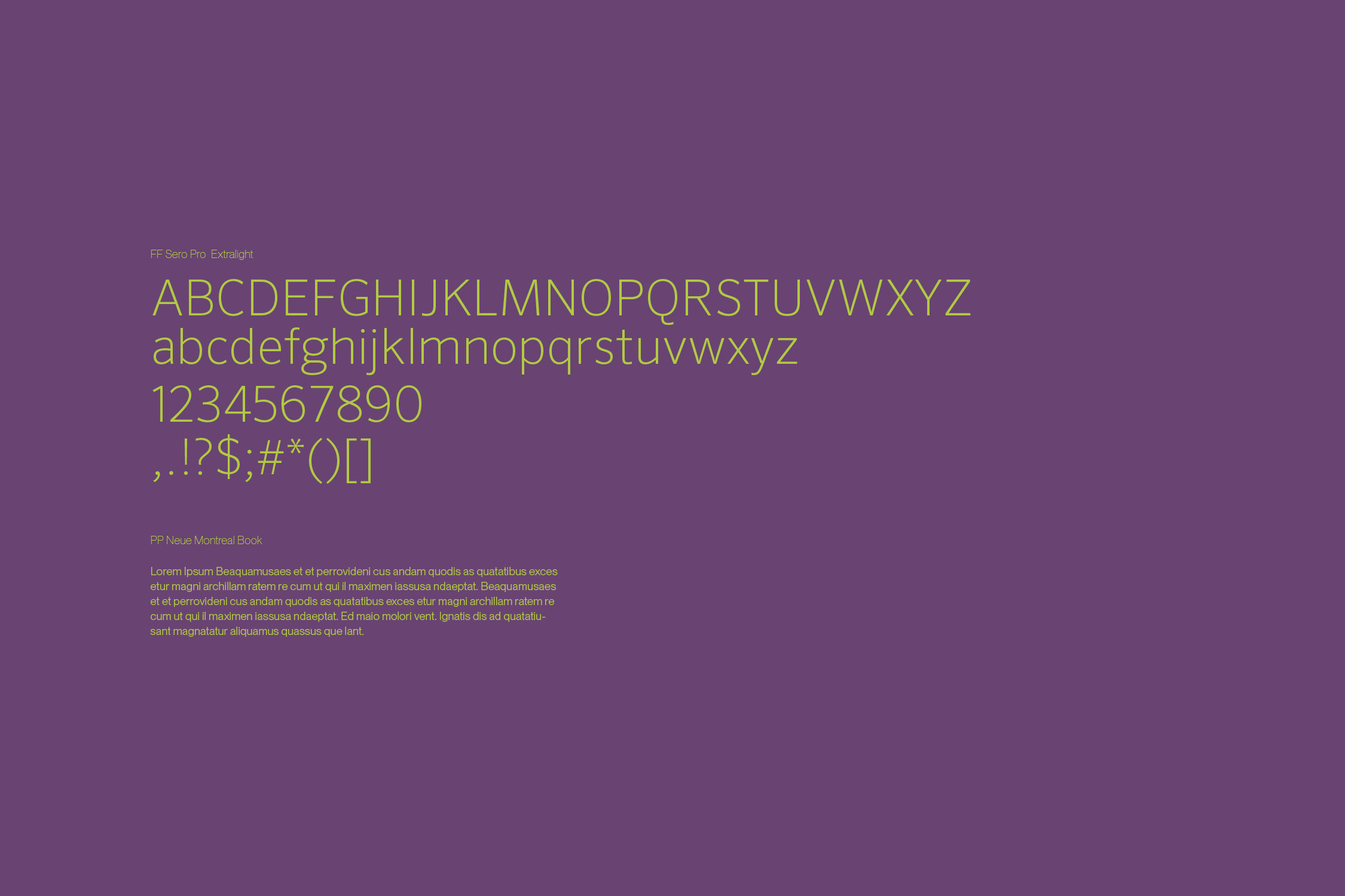
I decided on a more minimal logotype because the absence of decorative elements reflects the product’s streamlined functionality. Furthermore, this aspect is supported by the geometric typeface choice. To give more personality to the brand, I created an extended icon and pattern language that draws from biometric signals and heatwave imagery. These linear, spiral-based motifs introduce movement while maintaining structure, visually translating data flow into a controlled graphic expression. The colour choice was very intentional! Deep purple conveys intelligence and depth, while acid green introduces vitality and technological energy. This choice communicates a balance between science and creativity.