logo
branding
packaging
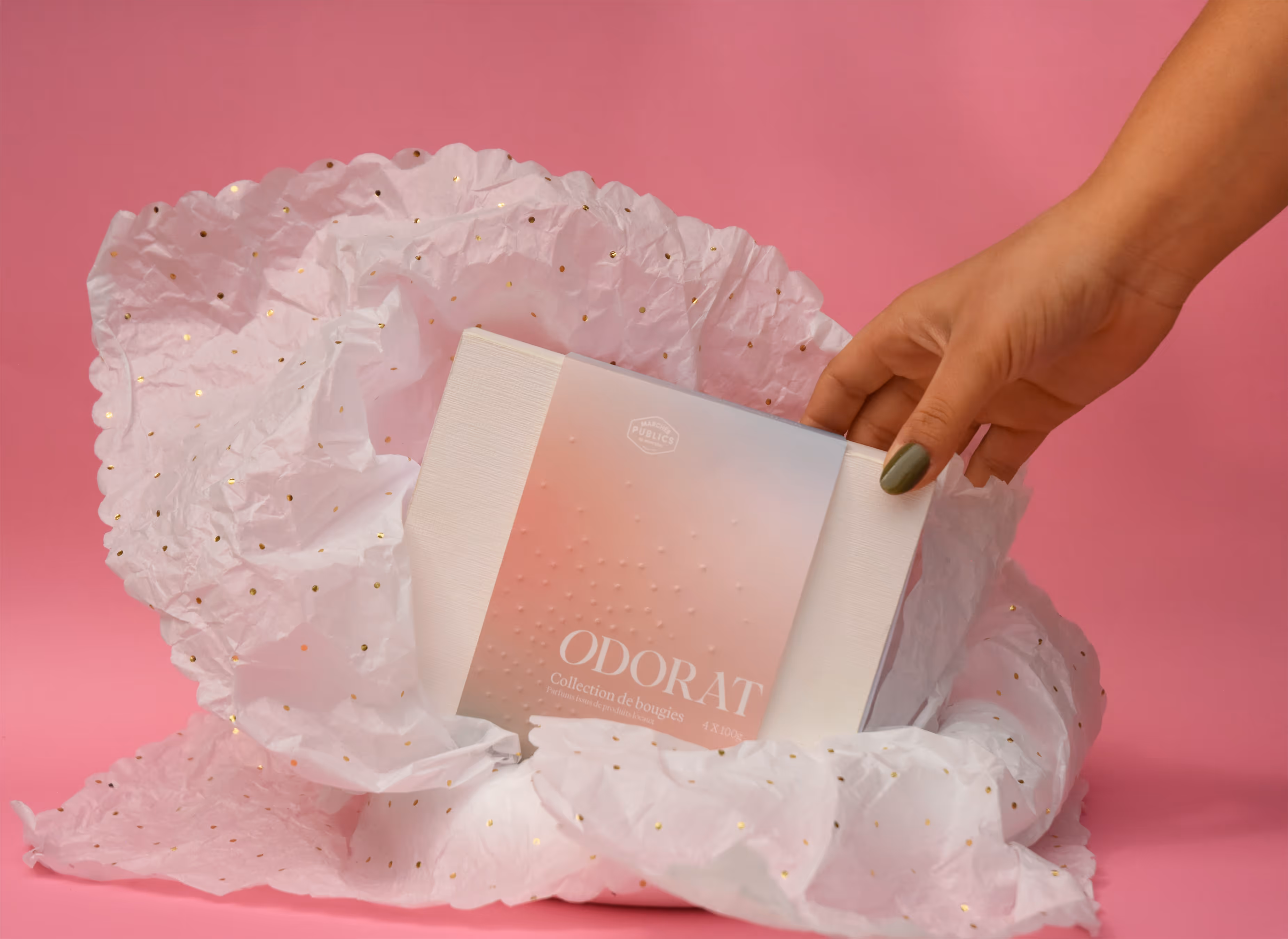
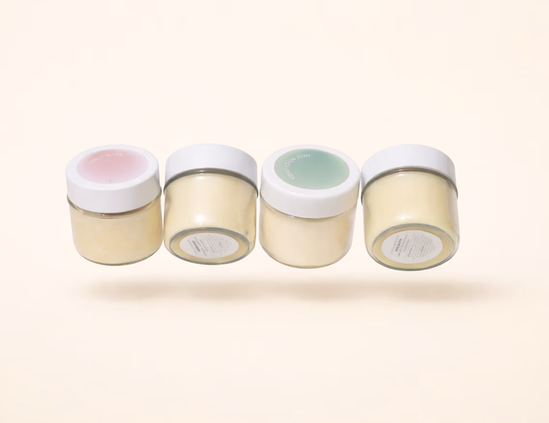
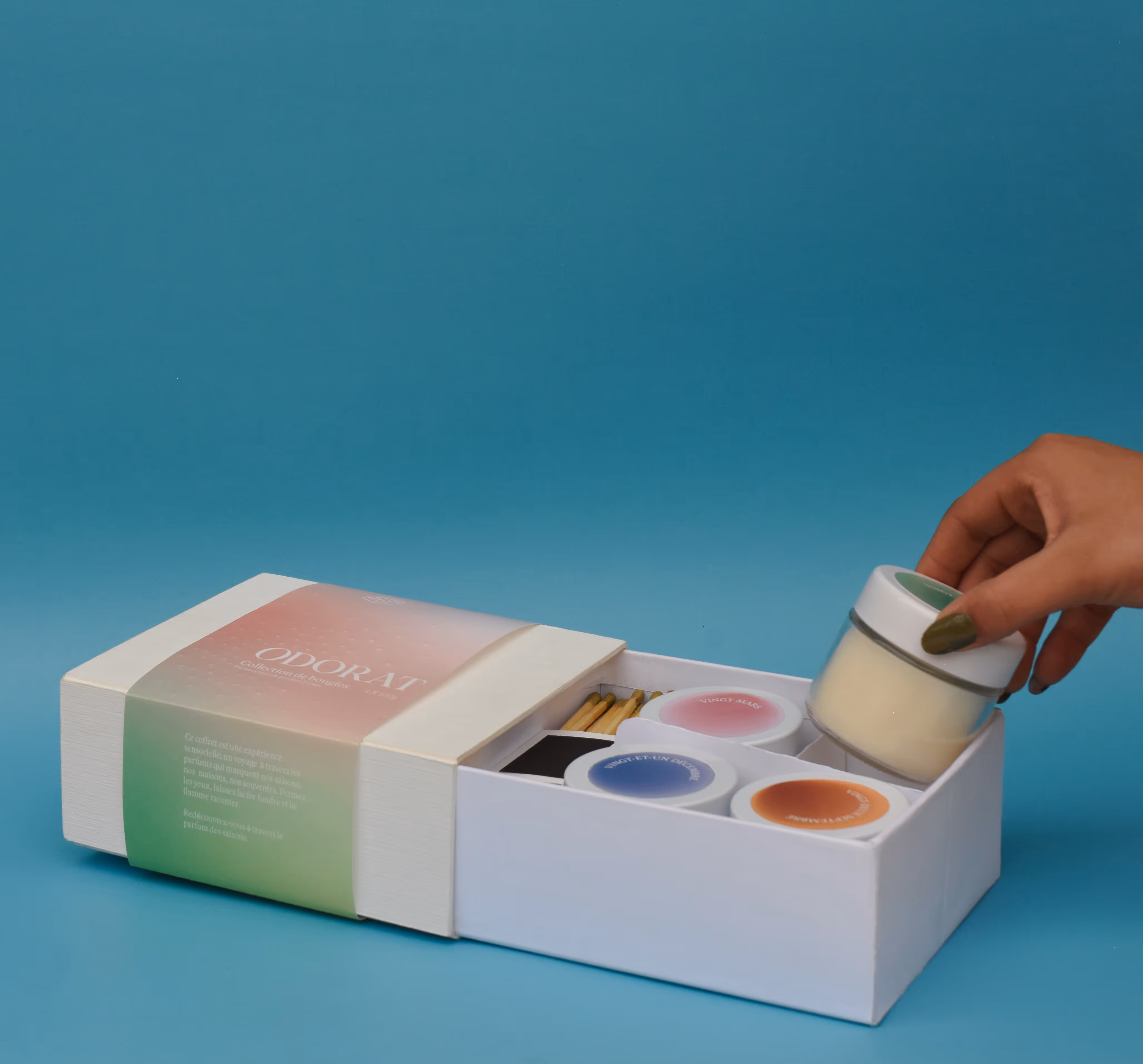
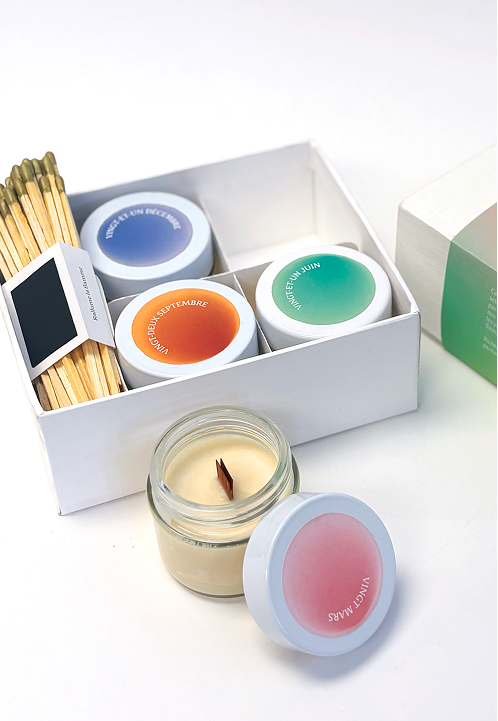
Candle Discovery Set
discovering odorat through the awakening of the senses
Odorat is a premium candle brand inspired by local produce and Quebec’s seasons. This project defines its positioning and introduces a discovery set that connects scent, memory, and place through life in Montréal.

the brief
who
Odorat is a brand under the umbrella of Marché Publics, an association of local markets in Montreal. The brand offers higher-end candles inspired by local produce.
whom
This product will cater to young adults between the ages of 20 and 35 years old who value slow living and local craftsmanship, with spare income to treat themselves and others. I decided to narrow it down to three specific archetypes, which guided my creative process through the project. I designed for Alex, 29, the ritual lover who prioritizes calm, quality, and well-being. Clara, 22, the souvenir seeker who enjoys local culture, authenticity, and finding valuable keepsakes while travelling. Lastly, Julia, 34, the thoughtful giver who places importance on intentionality, elegance, and connection.
why
The project is to create a discovery set of four small candles for Odorat, each capturing the unique scent and essence of Quebec’s four seasons to introduce the brand to new customers.
the spark
My first task was to define Odorat's positioning. After conducting research, I realized the brand could distinguish itself from competitors like Moonday, Soja & Co, and Mimi & August by connecting scent to memory and to Quebec’s distinct seasons. While these brands excel in minimal aesthetics and functionality, they leave space for a more emotional, place-rooted narrative that transforms a simple candle into a meaningful, sensory experience.
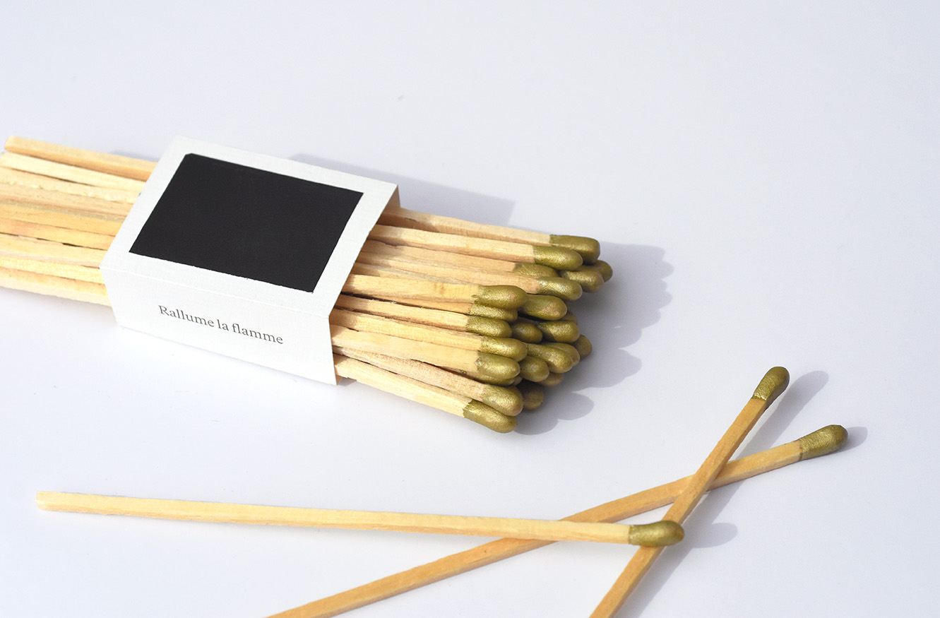
This thinking led to my core inspiration: creating an immersive experience that could be enjoyed instantly. When offering a gift, there’s nothing worse than not being able to use it right away. For candles, the “batteries” are the matches. Integrating them directly into the packaging became both a conceptual and structural challenge. Solving this constraint pushed the design further, resulting in a refined, elevated solution that reinforced the product’s premium positioning while deepening the storytelling.
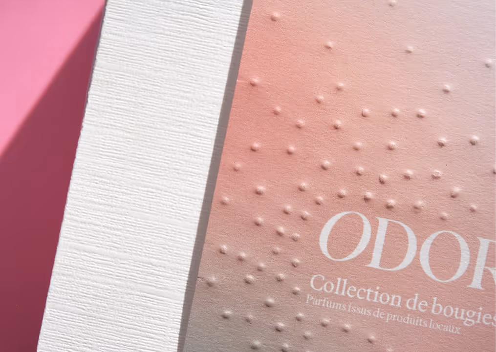
The Detail of Storytelling
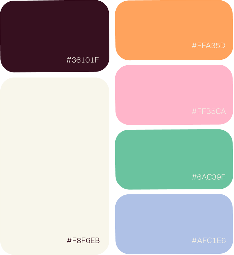
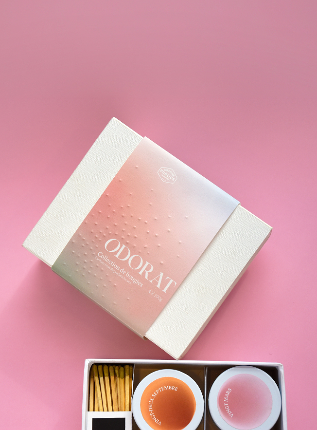
The colour palette, built around soft cream tones, gives the set a refined, high-end feel, while subtle accent colours add a playful touch that stays neutral and inclusive. The choice of paper and materials strengthens the sensorial aspect of the experience, especially through the embossing on the sleeve, which visually and tactually echoes the way scent diffuses. The blind embossing adds a quiet layer of luxury, while the seasonal gradient reflects the passing of time and invites each person to connect to their own memories and emotions. Structurally, the matches are integrated into a side compartment created through precise scoring and folding of a single sheet, held in place with a sleeve that neatly incorporates the striker paper. All these details come together to create an immersive object that feels thoughtful, giftable, and personal to whoever receives it.


want to see more?
work gallery