branding
motion
jazz bar branding
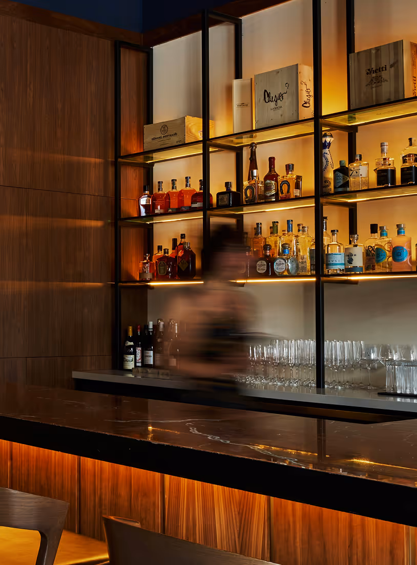
Bringing life to a lively space
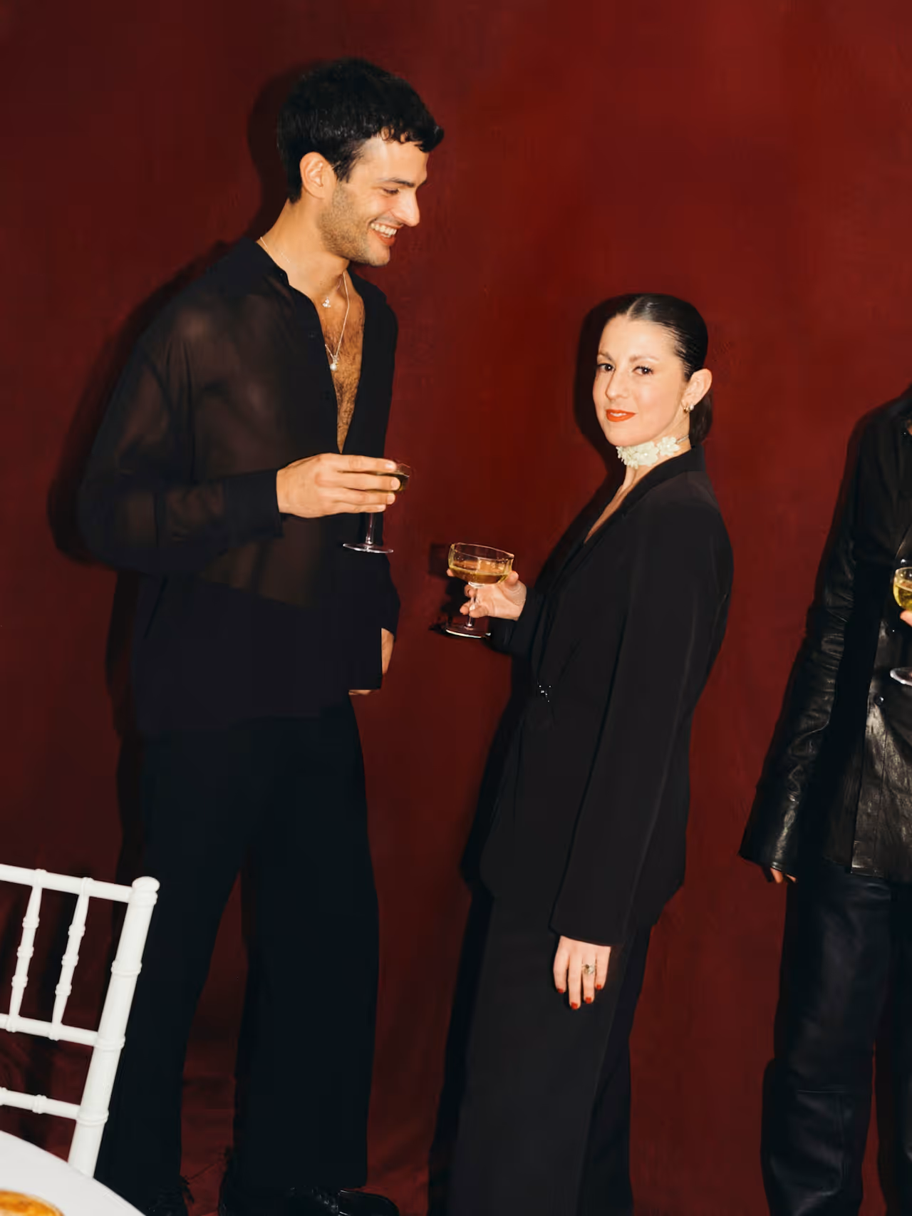
Arosé is a jazz cocktail bar for a new generation seeking curated, immersive experiences. Its bold, cohesive identity reimagines jazz aesthetics into a contemporary, versatile system.

the brief
who
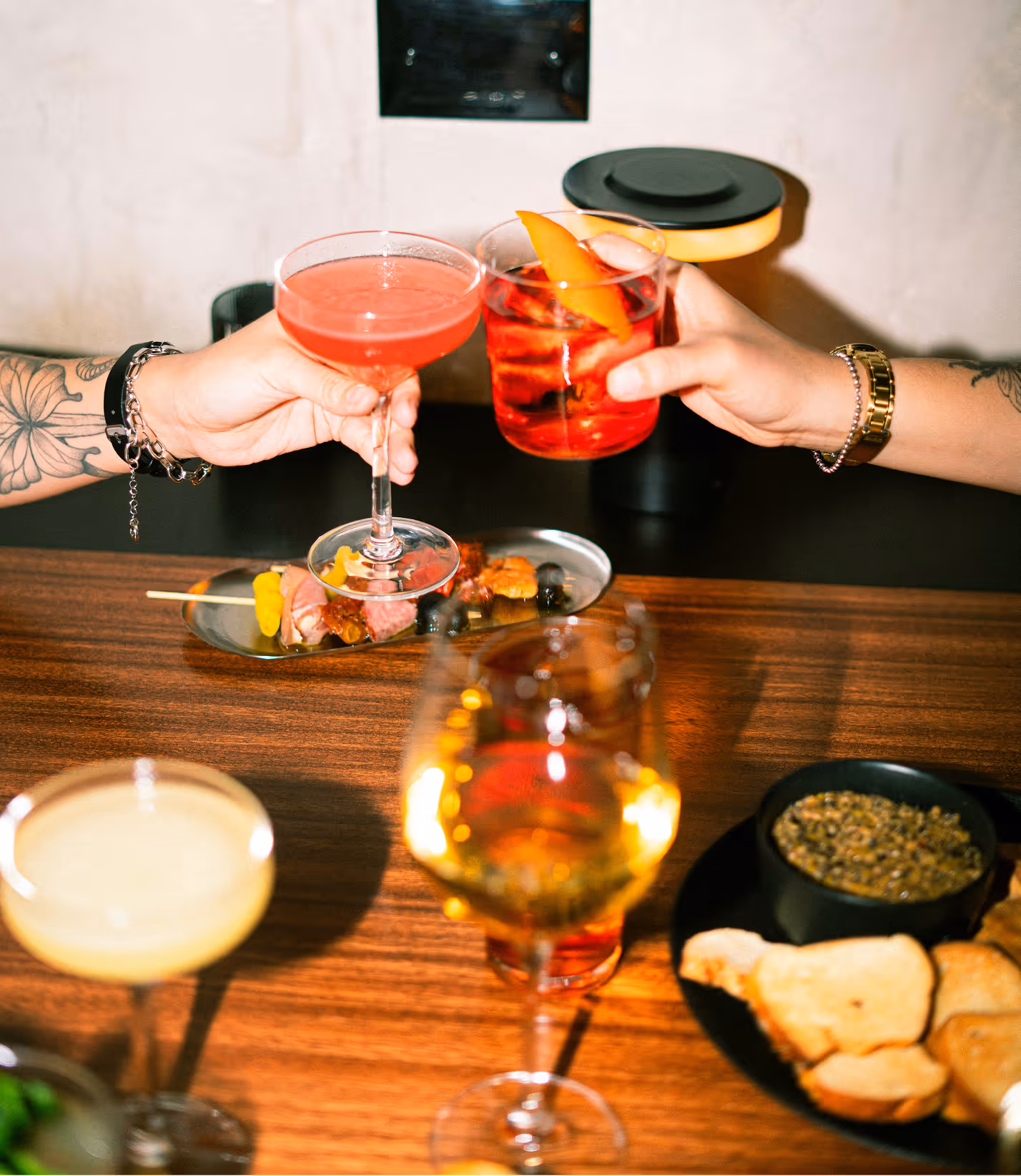
Arosé is a jazz cocktail bar that offers an immersive nightlife experience where live music, mixology, and refined aesthetics converge. The brand positions itself as a hybrid cultural space, as a performance venue and a sophisticated nightlife destination.
whom
Arosé targets young professionals and creatives aged 23 to 35 who are drawn to curated experiences. This audience seeks more than just a night out; they look for atmosphere, identity, and spaces that feel distinctive, social, and visually compelling.
why
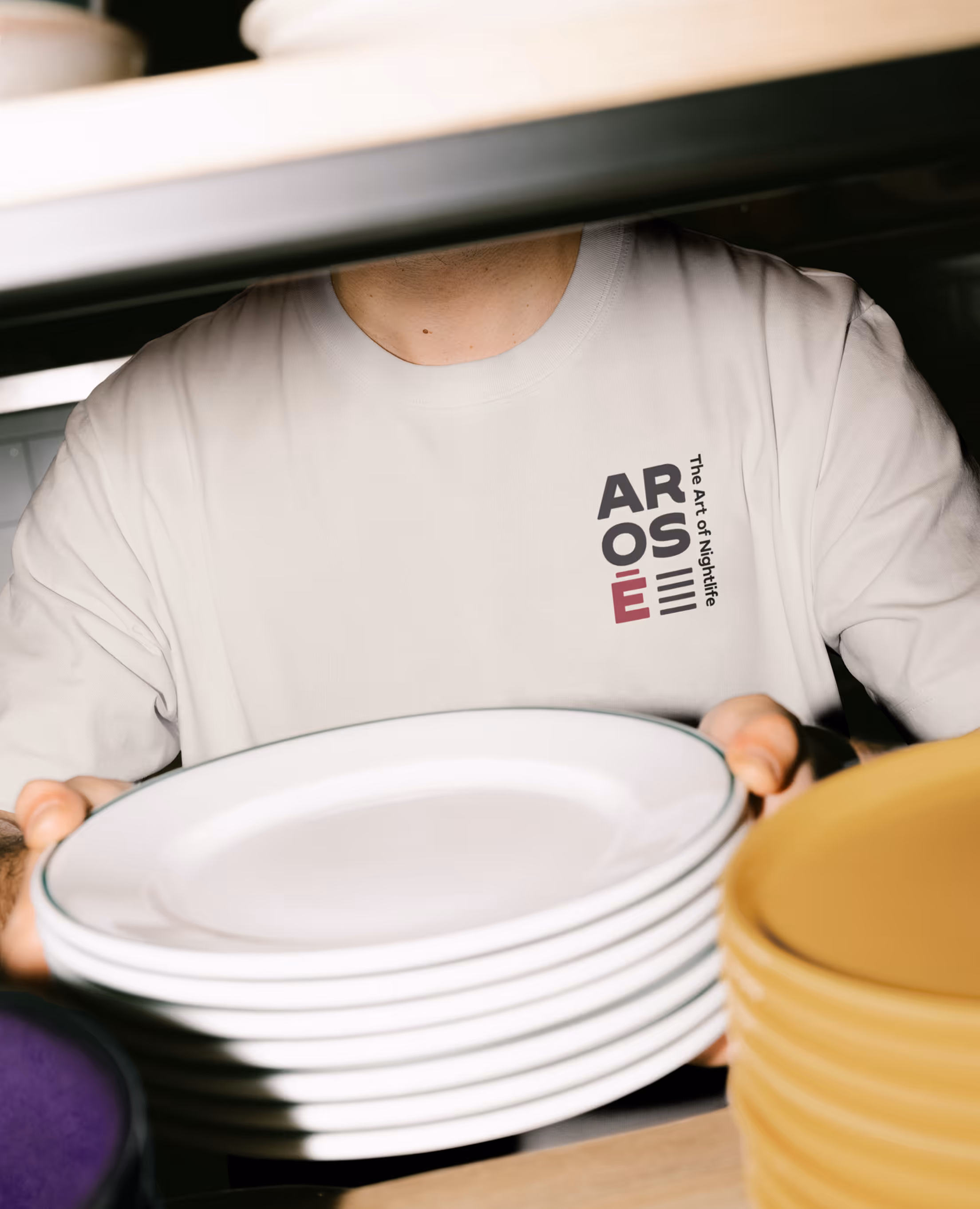
The mandate was to create a visual identity that reflects Arosé’s defining characteristics: playful, chic, and unapologetically bold. The objective was to design a versatile logo system capable of adapting across multiple applications, including promotional materials, staff uniforms, social media, and printed products.
the spark
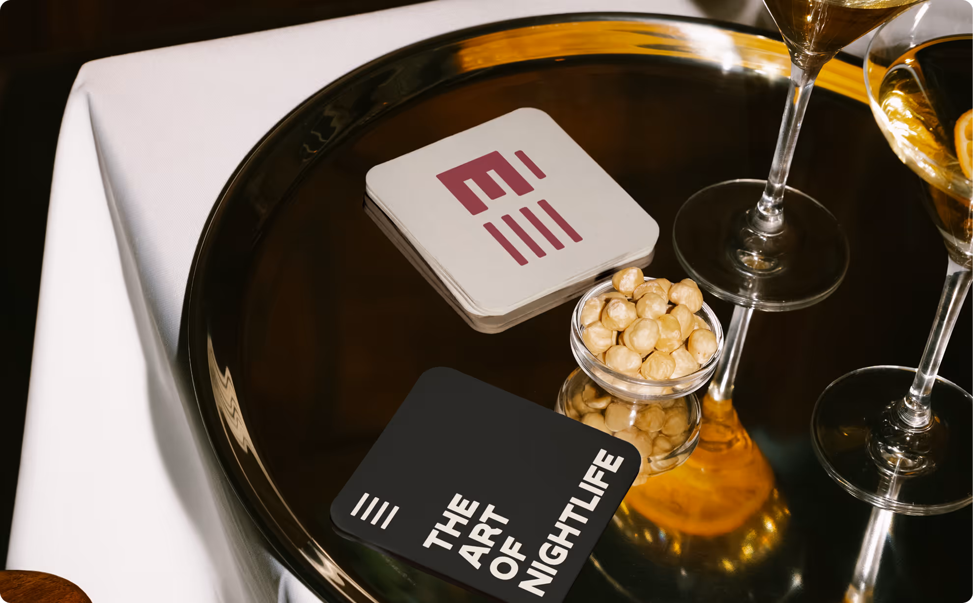
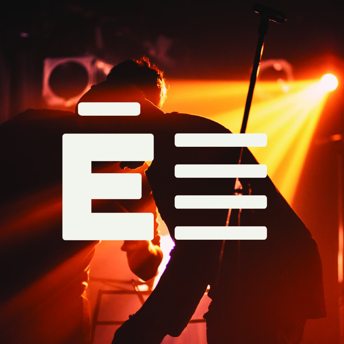
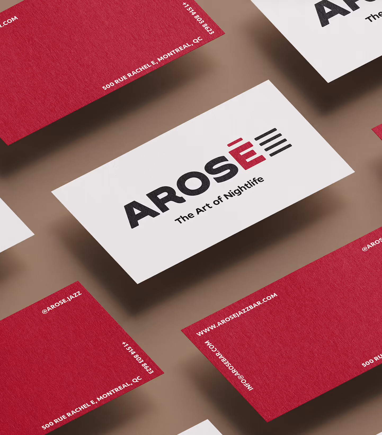
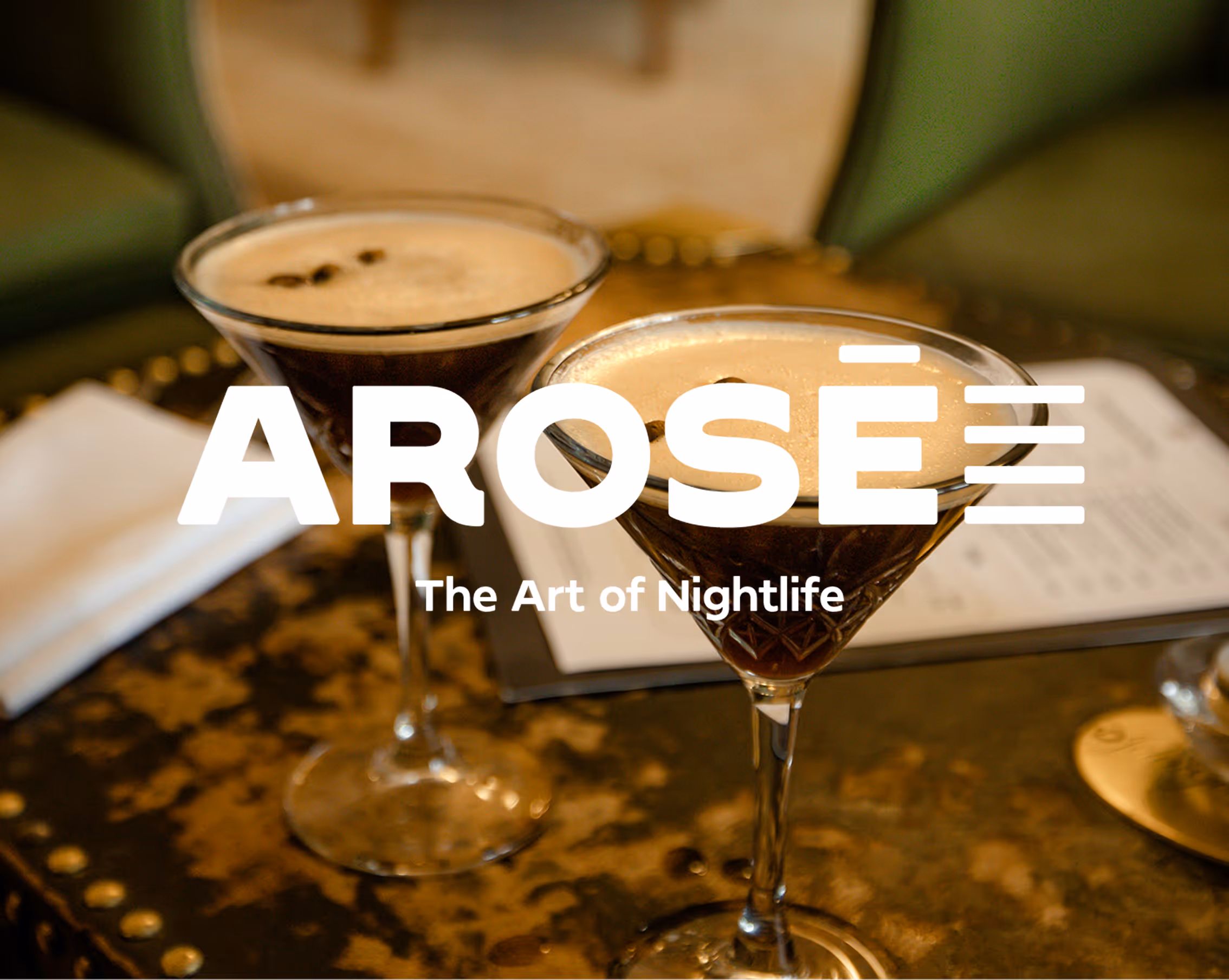
Jazz bars often rely on highly recognizable visual symbols such as saxophones, piano keys, or the color red. It was important for me to move away from these clichés for a more timeless logo that expressed Arosé’s bold and contemporary personality all the while being quickly recognizable as a jazz bar.
The spark came from the “É.” This letter is a distinctive element within the name and immediately sets it apart. I wanted to emphasize it rather than treat it as a secondary detail. While exploring its form, I noticed that the accents could visually echo the rhythm of piano keys. From that observation emerged my interpretation of a contemporary, abstract representation of piano keys. It’s subtle, graphic, and integrated directly into the typography!
the detail of storytelling
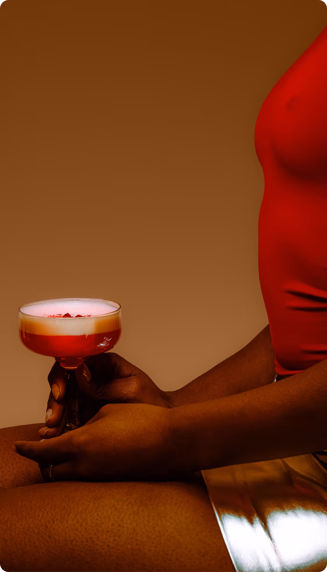
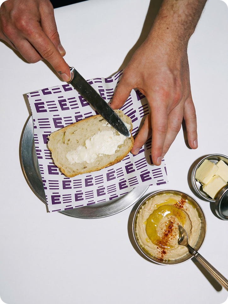
Arosé’s color palette blends sophistication and vibrancy, with deep purples and burgundies setting a chic, intimate mood, while soft golds and creams add warmth and elegance. Charcoal black grounds the design, reflecting the bar’s mysterious and upscale ambiance, perfectly suited for young adults and creatives seeking a dynamic yet refined nightlife experience.
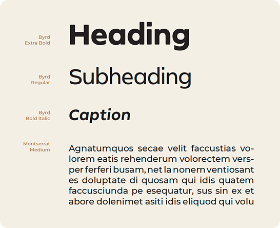
Arosé’s typeface choice is bold and innovative, steering away from the conventional geometric or serif styles commonly seen in jazz bars. The rounded strokes infuse the brand with personality, creating an approachable, bubbly vibe that reflects Arosé’s lively yet sophisticated atmosphere.
Together, these design decisions build a cohesive and distinctive visual identity that captures Arosé’s character while fulfilling the mandate of creating a versatile, recognizable brand system adaptable across multiple applications.
want tosee more?
work gallery