packaging
promotional design
Promotional Material
EXPRESSING THE INNER PEACE OF JOHN ZORN’S OU PHRONTIS
Chaos and calm collide in John Zorn’s Ou Phrontis. Bold contrasts and structured layering create a promotional identity that mirrors the music’s intensity and meditative depth.
the brief
who
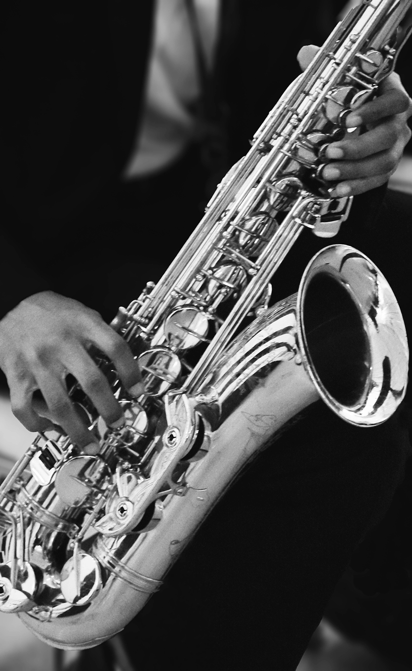
Ou Phrontis is an avant-garde performance by John Zorn, the influential American composer and saxophonist known for blending jazz, experimental composition, and free improvisation. Released in 2024, the work combines intense energy with unconventional sound structures and philosophical depth.
whom
Listeners are drawn to expressive, unconventional performances. The audience includes musicians, creatives, arts students, and dedicated avant-garde jazz enthusiasts, as well as an international crowd shaped by Zorn’s global reputation in experimental music.
why
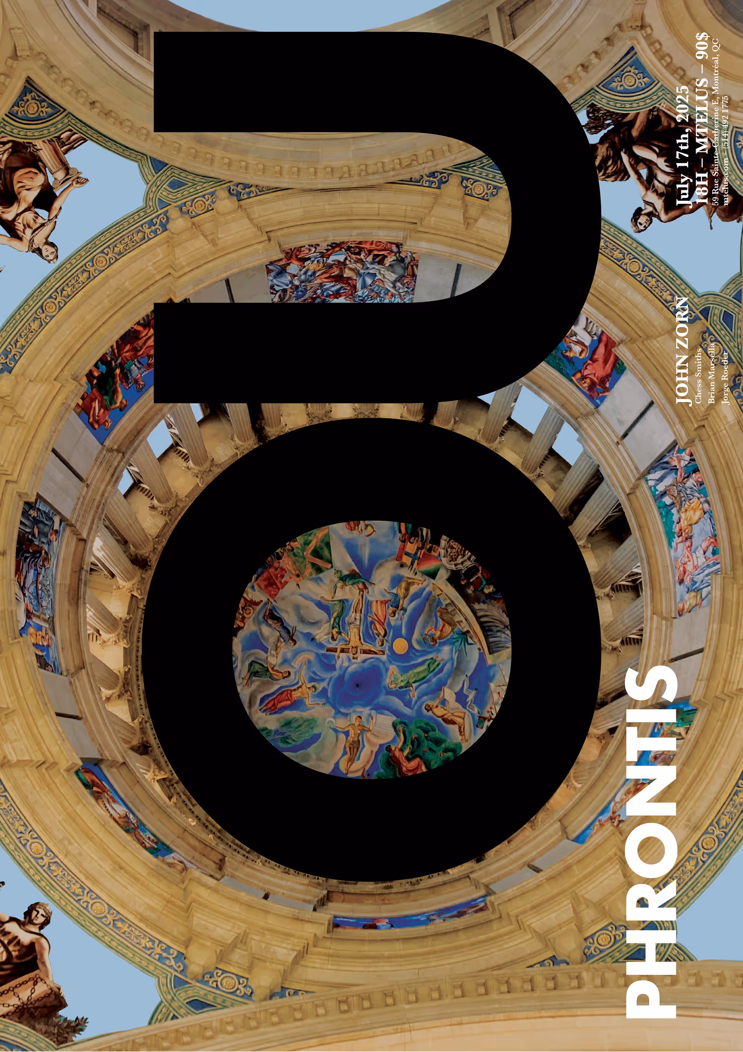
The need was for a promotional poster with a strong and distinctive visual identity that reflects the intellectual and experimental nature of Ou Phrontis. The design must be adaptable across multiple applications, including social media campaigns and a special edition vinyl. The goal is to build a cohesive visual system that maintains impact and recognition while translating seamlessly between physical and digital formats.
the spark
The ideation for this project was extensive. What resonated most with me was the music’s meditative quality beneath its intensity. Ou Phrontis means “who cares” in Greek, and the album draws influence from T.E. Lawrence’s stoicism alongside Zorn’s strong Jewish heritage.
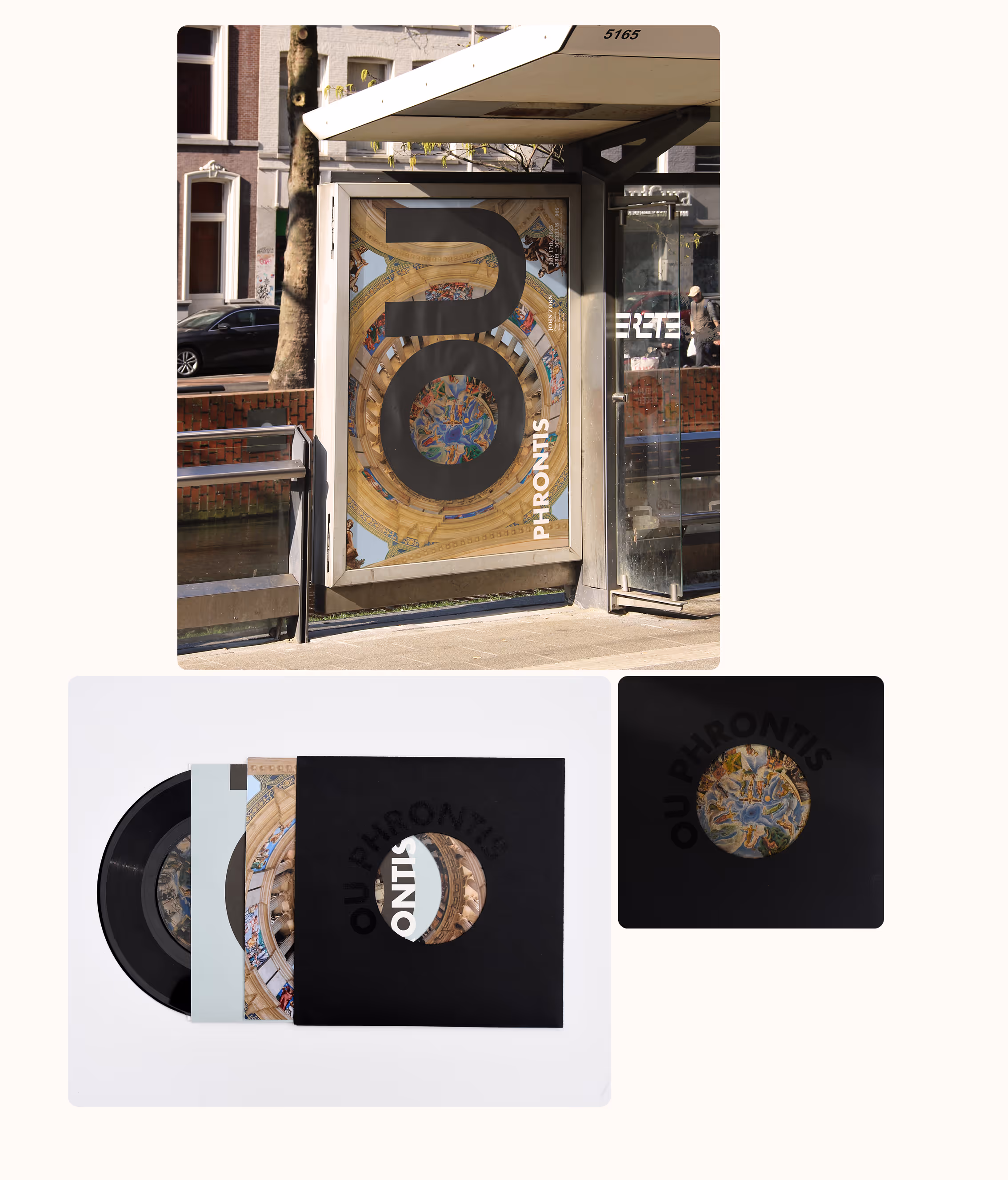
An image I photographed at the National Museum of Art of Catalonia became the turning point. The intricate ceiling mural, full of movement and detail, reflected the tonal complexity of the music. This idea of finding calm within chaos guided the entire art direction. Every decision echoed that balance between storm and stillness.
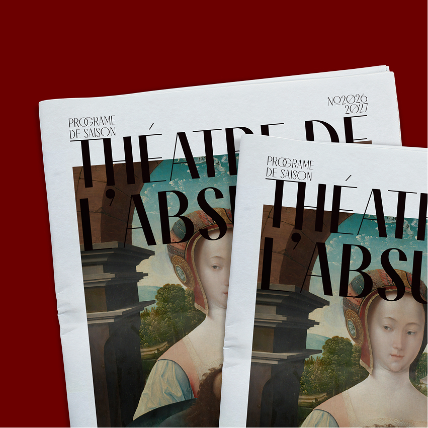
The Detail of Storytelling
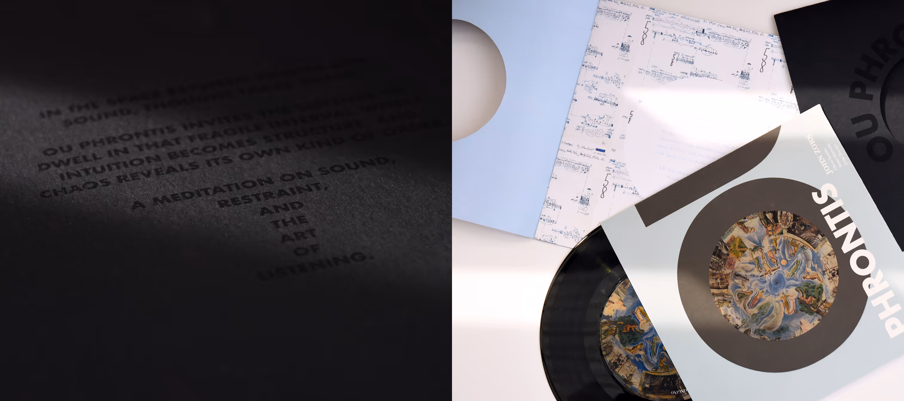
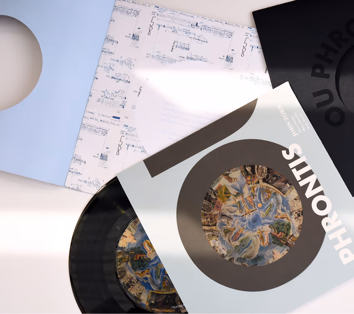
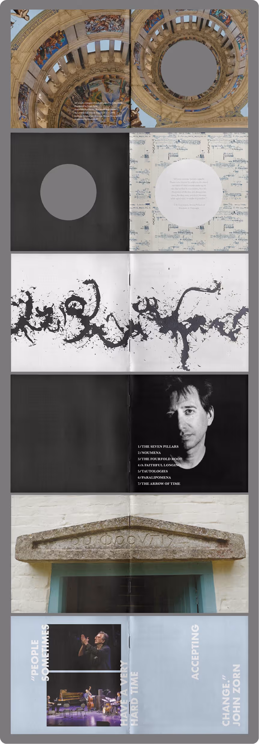
The storytelling unfolds through contrast and tension. A geometric typeface introduces a sense of structure and severity, standing in deliberate opposition to the intricate, almost chaotic ceiling mural. This dialogue between order and complexity mirrors the music itself, where intensity and meditation coexist. A restrained light blue softens the composition, creating moments of calm against the bold black typography.
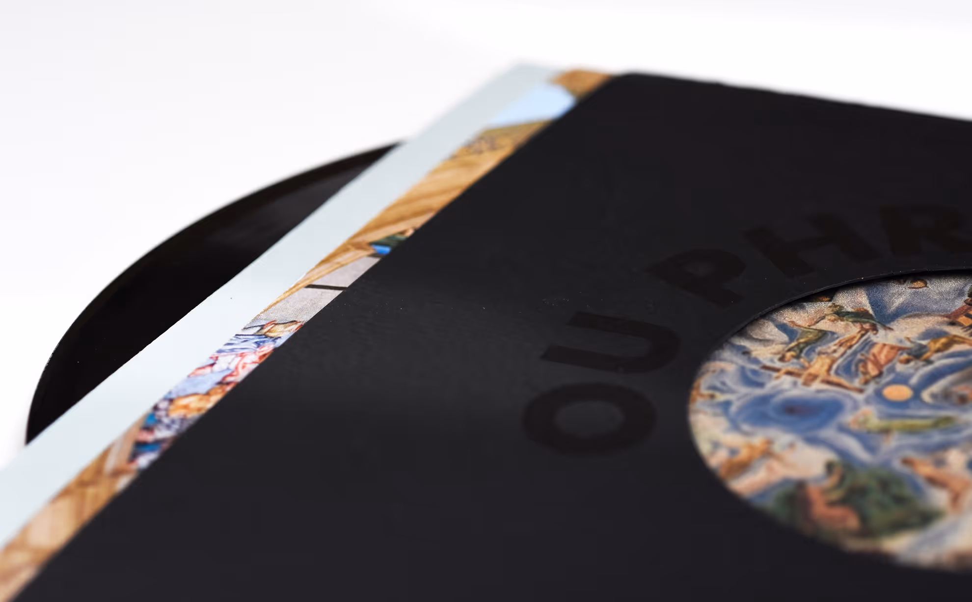
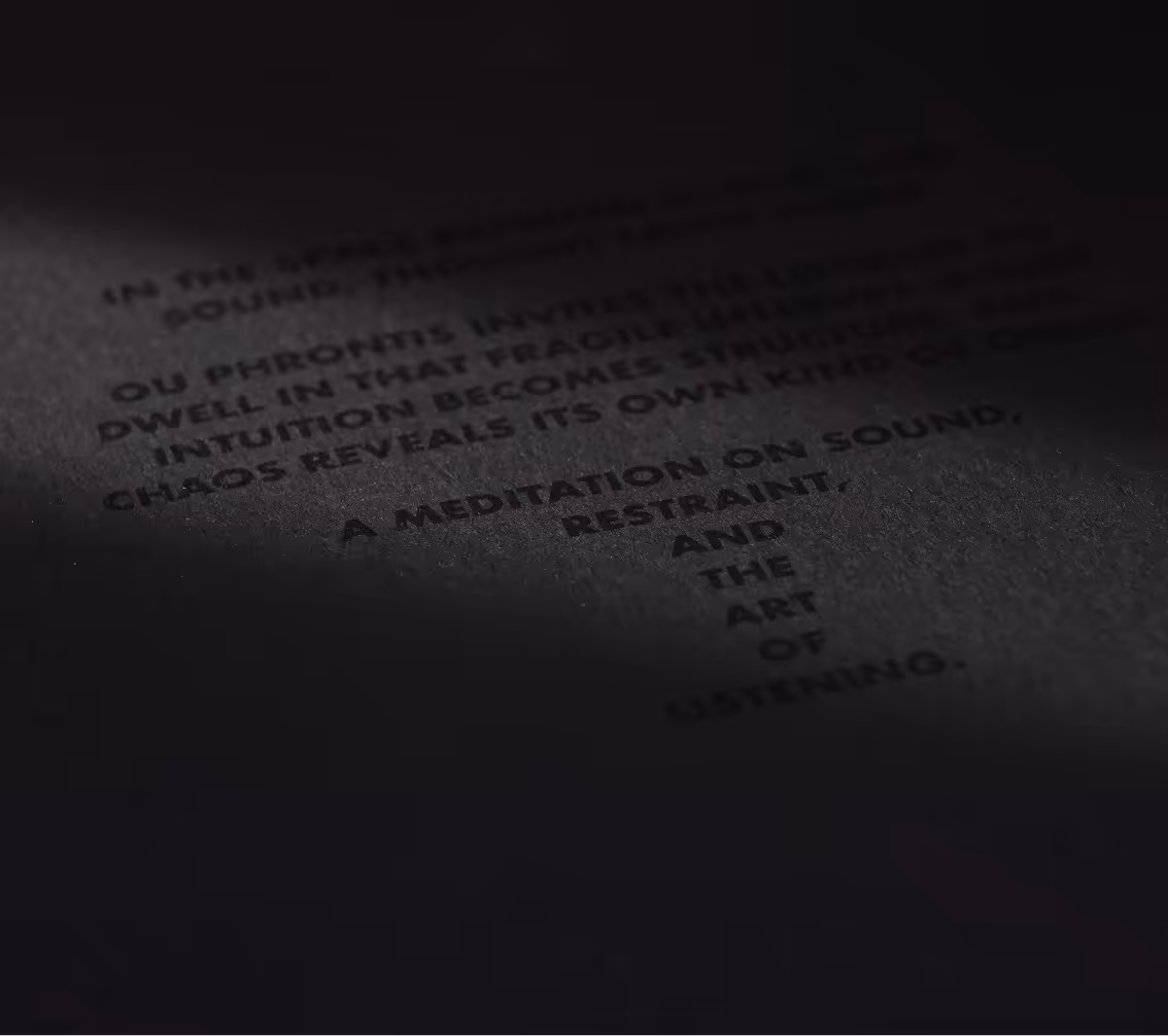
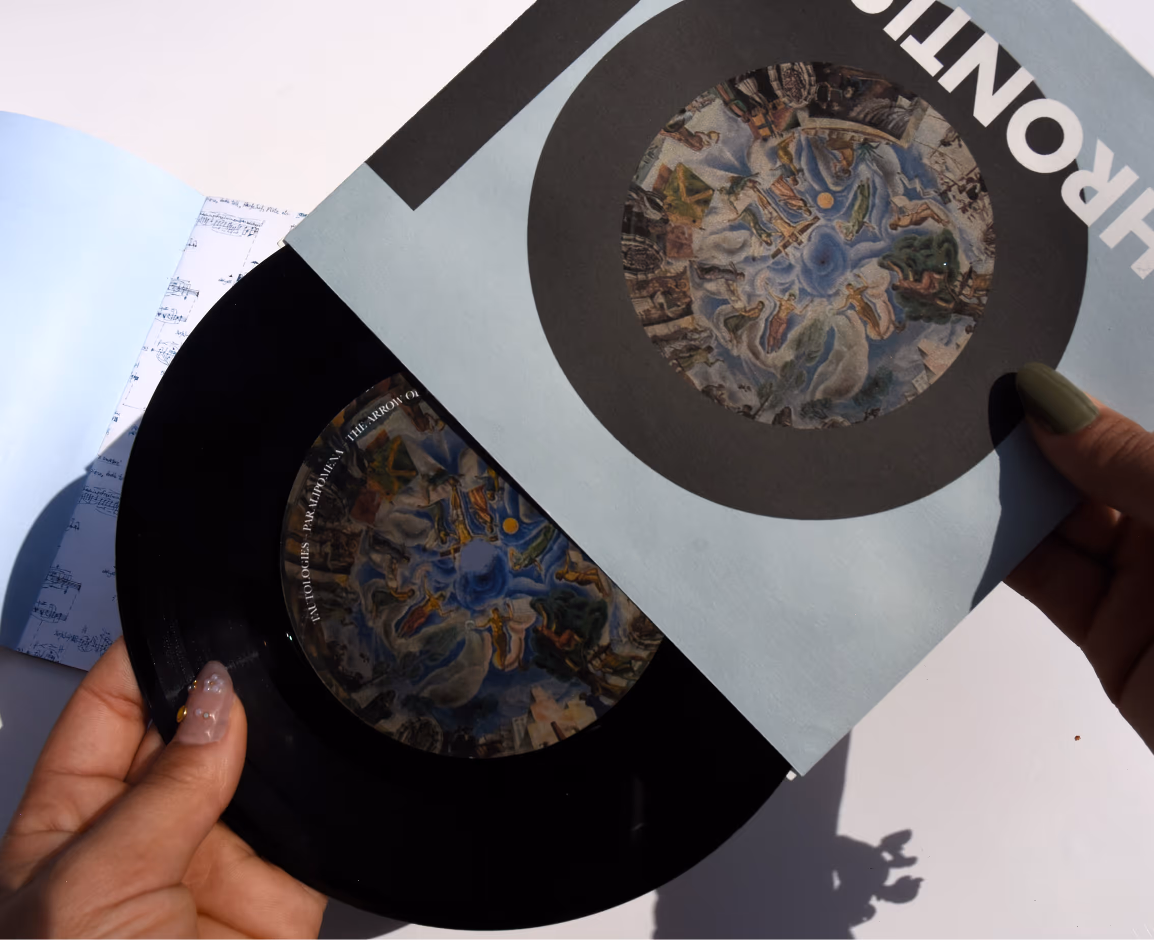
In the vinyl edition, die-cuts create a focused aperture, reminiscent of a lighthouse cutting through a storm, directing attention and eliminating visual noise. The use of black varnish on black paper adds a layer of subtle sophistication that only reveals itself upon closer inspection, encouraging the viewer to slow down and engage. Every element works together to echo the central idea of the project: finding clarity and stillness within turbulence.
want to see more?
work gallery