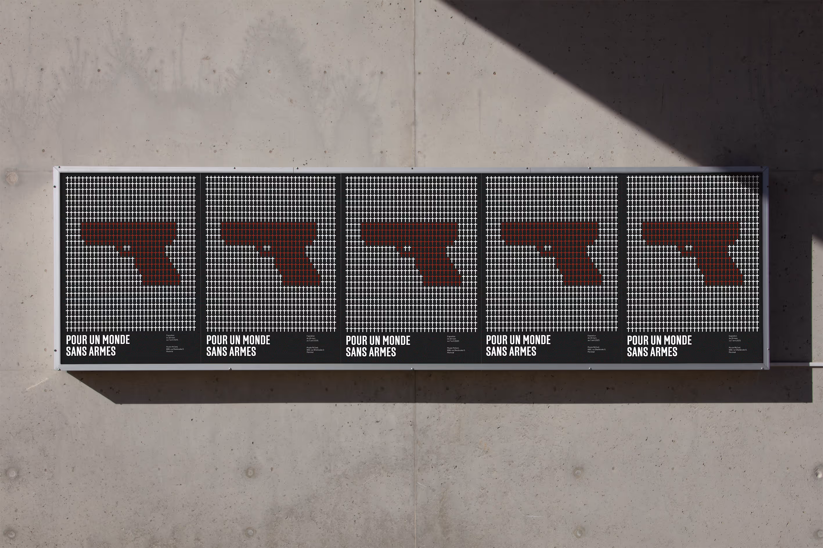

A visual response to Pour un monde sans armes, this poster highlights the consequences of gun violence through repetition, scale, and minimal design for immediate impact.

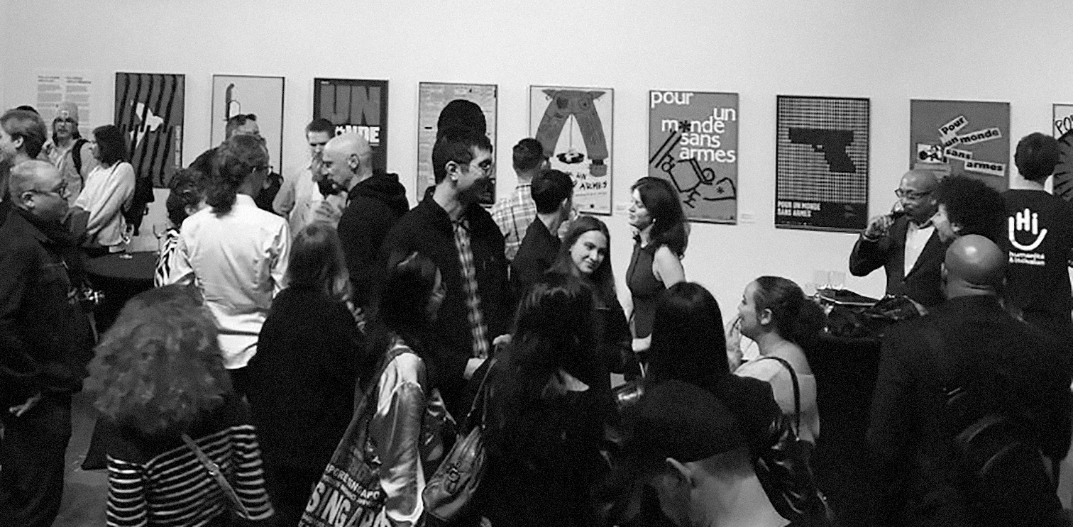
Mark H. Choko poster contest invites CEGEP and university students to create a social issue poster on diverse themes in collaboration with the Museum McCord, Publicité Sauvage, BAnQ, Humanité et Inclusion, and Centre design - UQAM.
The poster targets the general public in Montreal, especially students and socially engaged young adults encountered in high-traffic spaces such as metro stations, campuses, and cultural venues. It aims to raise awareness within a civic audience connected to global conflicts.
This year’s theme, Pour un monde sans armes, calls for a visual response to the growing impact of armed violence worldwide and locally. The mandate was to create a poster that raises awareness, encourages reflection, and supports the humanitarian mission of reducing violence against civilians.
The concept emerged while sketching ideas on how to represent the conflict. I began thinking about crosses marking graves, which brought me back to my visit to Arlington National Cemetery during my graduation trip to Washington. The endless green fields lined with white headstones left a lasting impression on me.
I wanted to recreate that same emotional impact. Instead of illustrating weapons directly, I chose to foreground the consequences of gun violence, confronting viewers with loss before anything else.
This thinking led to my core inspiration: creating an immersive experience that could be enjoyed instantly. When offering a gift, there’s nothing worse than not being able to use it right away. For candles, the “batteries” are the matches. Integrating them directly into the packaging became both a conceptual and structural challenge. Solving this constraint pushed the design further, resulting in a refined, elevated solution that reinforced the product’s premium positioning while deepening the storytelling.
By filling the space with repeated crosses, I was able to communicate the magnitude of the issue through accumulation. The density of the symbols creates visual weight, reinforcing the scale of loss.To ensure immediate readability in high-traffic environments, I integrated the red silhouette of a gun within the composition. This allowed viewers to quickly connect the graves to gun violence without relying on explanatory text.
Typography intentionally takes a secondary role, allowing the imagery to lead. The clean, minimal type treatment supports a direct, matter-of-fact tone, reinforcing the seriousness of the message without competing with the visual impact.